The Golden Mile Post
Client
Kalgoorlie Consolidated Gold Mines (KCGM)
Industry
Mining
Discipline
Art direction
Corporate communication layout
Project
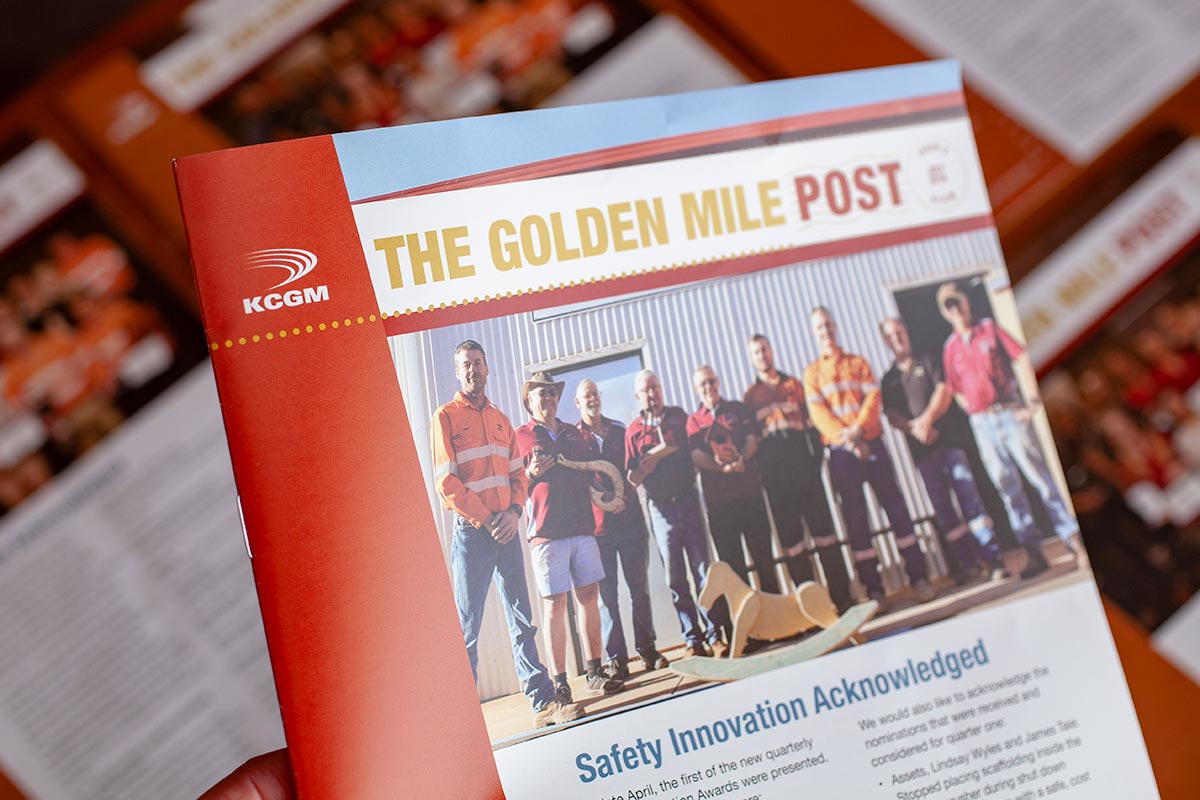
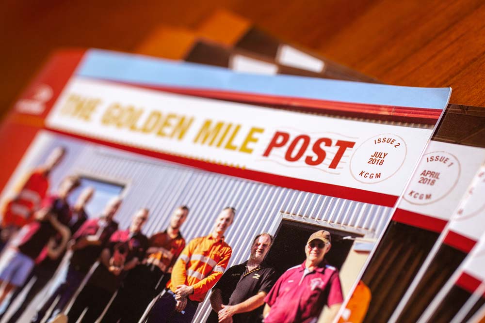
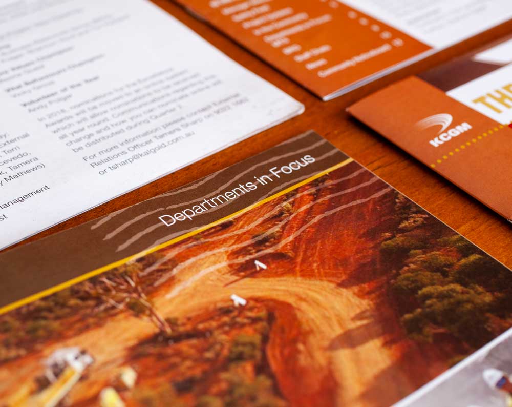
Engaging a whole workforce is difficult with corporate communications, especially with an existing and quite formal style guide. Imagine then, the task of turning that into an interesting coffee table read…
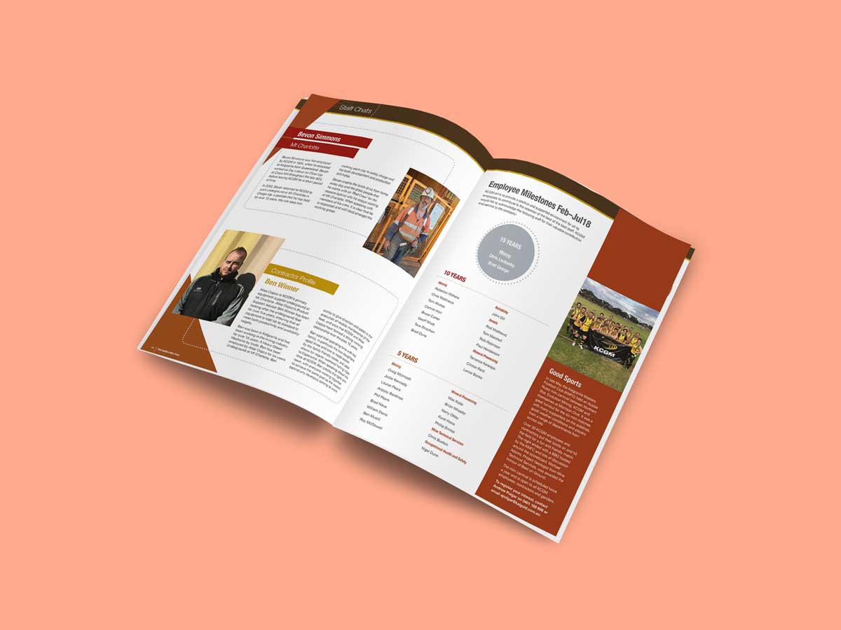
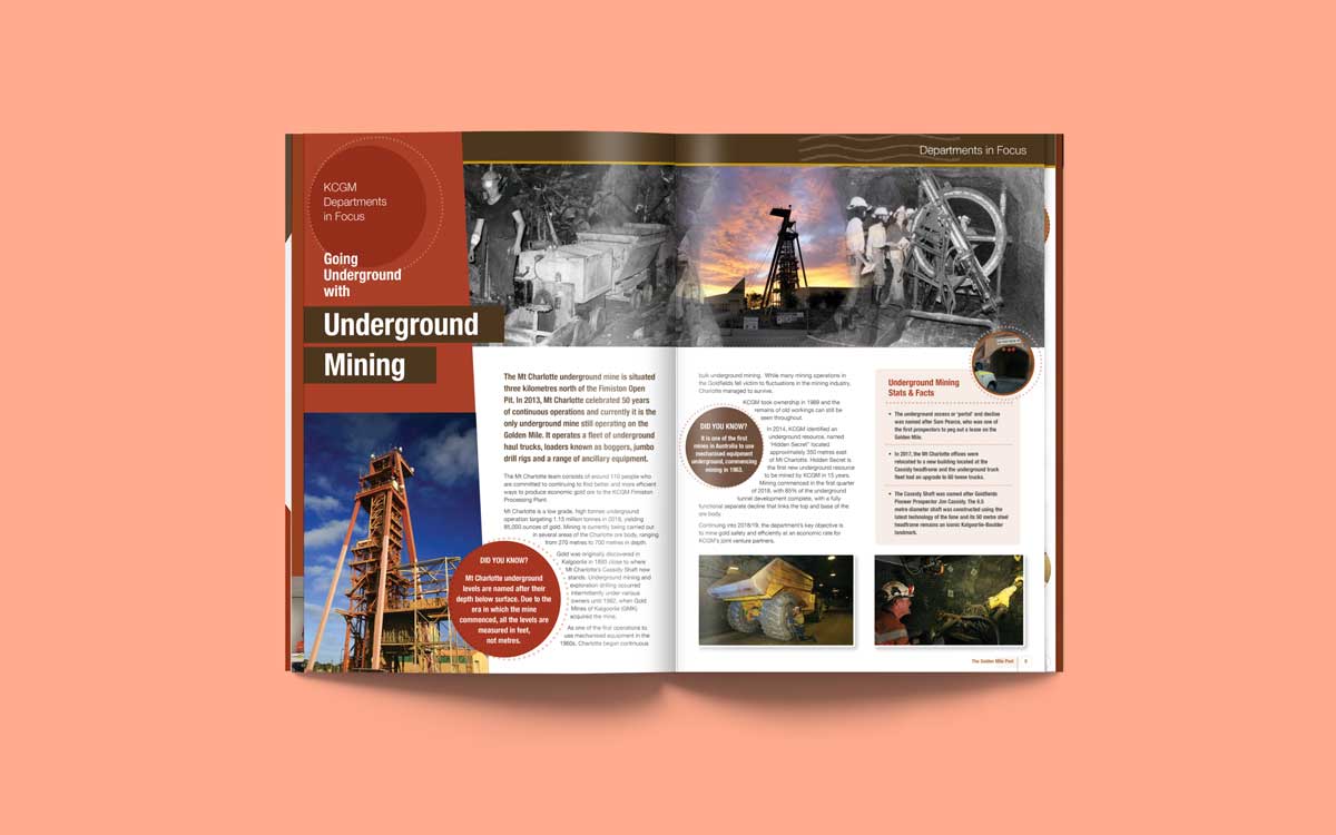
Taking the existing style guide and turning it on its head, we pitched a removal of the very corporate royal blue, favouring colours from the styleguide that reflected the rich, earthy colours of the local area and to truely tie in to the new name of the magazine, The Golden Mile Post. A simple yet flexible layout and colour palette is enhanced with the addition of less rigid shapes and patterns to add visual interest.
Who said corporate communication needs to be uninspired and boring?
