Nourish your Ability [re]brand
Client
Robyn Millar from Nourish your Ability
Project
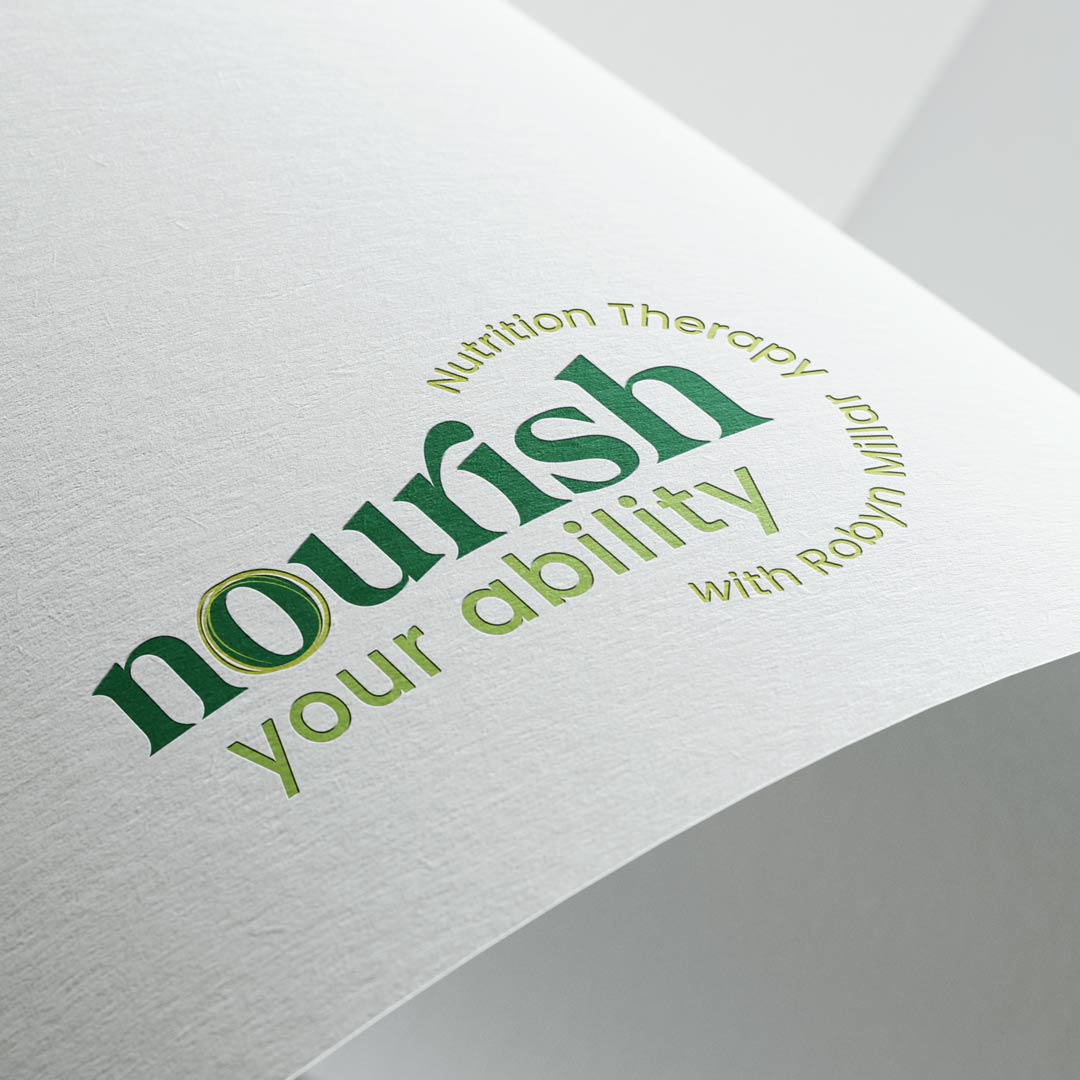
Say hello to the new logo and face of brand for Nourish your Ability, a nutrition therapy practice in Adelaide led by Robyn Millar, a Clinical Nutrition Therapist who specialises in individualised nutrition to support disability health, food intolerances, sensory and difficult eating behaviours.
Robyn felt she had outgrown her previous logo and wanted ‘a brand’, something cohesive and concise to what she does as a nutritionist. We worked together to reach this final outcome we are both really happy with, one that speaks to that feeling that the term ’Nourish’ evokes (wholesome, fresh, caring and empathetic), while paying homage to aspects of her previous logo.
Like many small businesses do when starting out, she had scraped together a logo, website and some other collateral herself to get by, but didn’t feel this accurately represented her business. She felt that overall it was lacking ‘empathy’, wanting something ‘softer and more feminine’. Robyn was keenly aware that she wanted a ‘brand’ that was reflective of her business and where it is heading.
The first step in the brand evolution was to develop a long term face of brand which paid respects to the original brand that Robyn had created. Research was an essential component of this process, exploring and reviewing contemporaries local and further afield to compare and contrast how their brand communicated to their audience.
The term ‘nourish’ is a popular term that has come from a growing health and wellness focus, with lots of businesses using this term in their name. Very few did this in a way that reflected the feelings of what the term nourish evokes – wholesome, fresh, supportive and empathetic, like a warm hug or a comfort blanket.
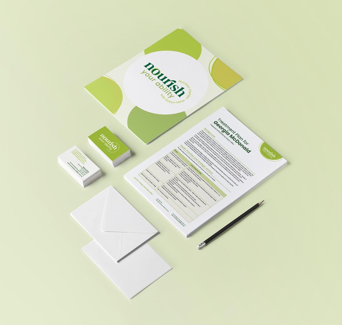
Following from the logo, a suite of small assets was developed, from social media tiles to branded word template. Finally, we got to tackle the website.
Overall, we were able to provide a new brand and translate this across the website and supporting material that achieved the following:
- Rebranding shift – changing perceptions from ‘general nutritionist’ to a specialist professional working with NDIS clients
- Greater focus around Robyn’s personal story and own lived experience in the NDIS field that differentiates her from her competitors to empathise and attract more of her ideal client
- Clearer, targeted core services, CTAs and visual storytelling that resonates with brand and target audience
- Website analytics point to growth in traffic, growing month on month, Increased session visitors of her target demographic or footfall and the corresponding sales increase
- Clearer information across all client-facing touchpoints – streamlining business operations
- Overall enhanced brand perception – modern, clean, fresh, empathetic and easy to digest


